Looking for property?
Get neighborhood and property data directly on Rightmove and Zoopla listings.

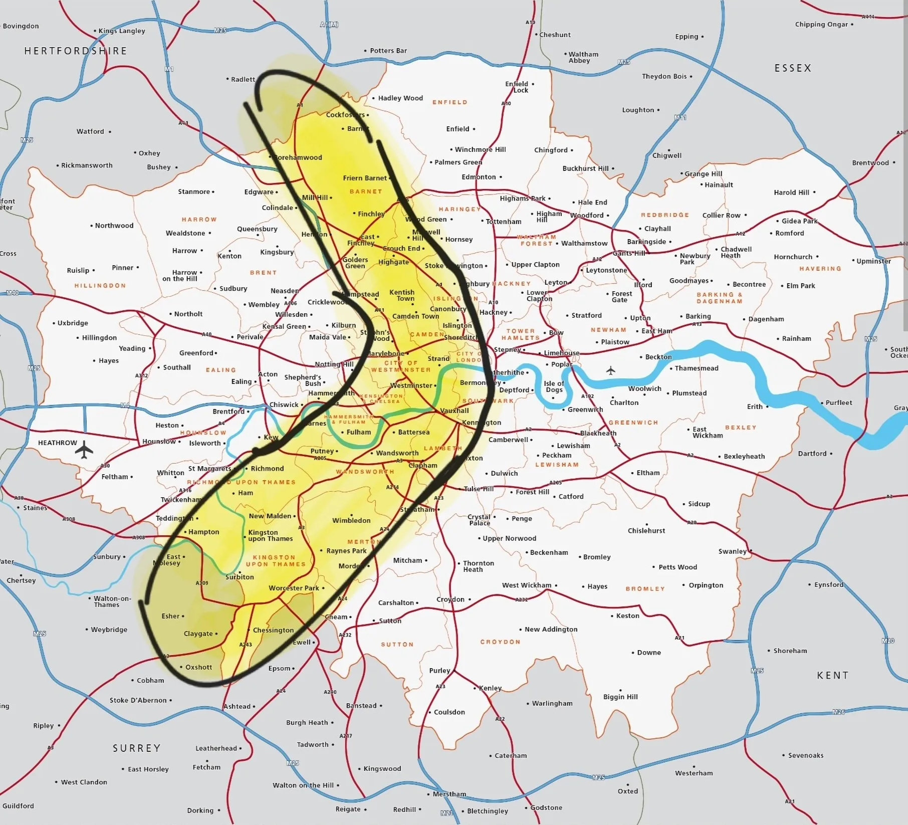
In early September 2025, a curious phrase started trending across London media: the London Banana. The Evening Standard, Daily Mail, The Times, and Metro all reported on a colourful map that carved a banana‑shaped swathe through the capital, supposedly outlining the most desirable places to live. Depending on which headline you read, the Banana was either London’s “loveliest” zone or a snub to all the areas left outside the yellow curve.
The shape stretches from Kingston in the southwest, curving through Richmond, Wandsworth, Kensington, Westminster, Camden, Islington, before arcing northeast to Barnet. It is essentially a horseshoe hugging the wealthier, greener, and historically pricier boroughs of inner and outer west London. The idea: if you live inside the Banana, you’re in a “good” part of the city.
But how much truth is there in this outline? Is the Banana simply a catchy headline, or does the data back it up?
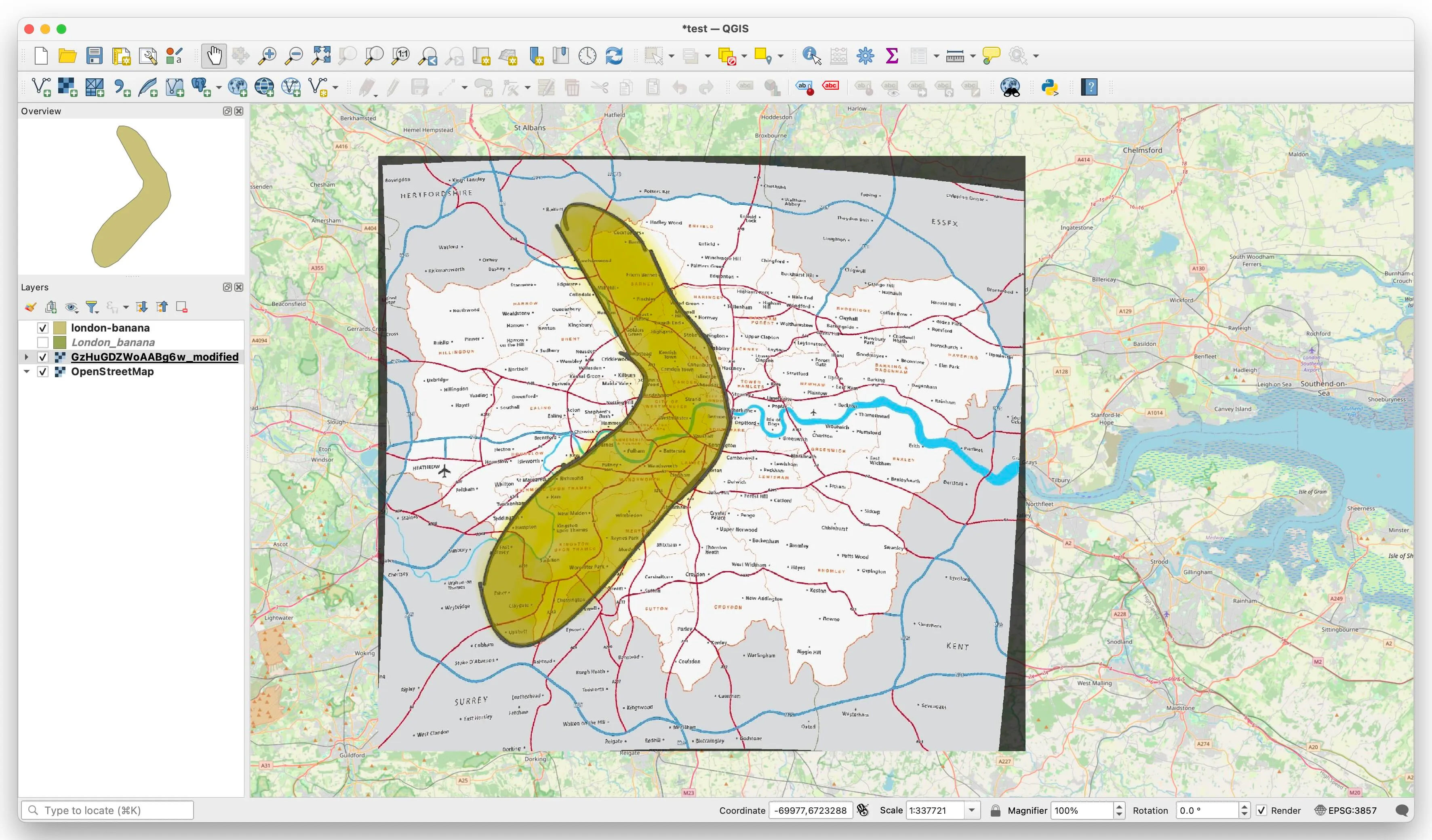
I used QGIS and the original Banana image circulating on X.com to georeference and map the Banana outline onto real London coordinates. This step allowed for postcode-level comparisons rather than just eyeballing borough shapes. Let
Using Area360 datasets (Land Registry, ONS, Police.uk, TfL, EPC and more), we compared neighbourhoods inside the Banana to those outside. This allowed us to calculate property prices, income, deprivation levels, social housing proportions, and crime rates.
| Council | Total postcodes | Postcodes Inside Banana | Inside Banana, % |
|---|---|---|---|
| Westminster | 13136 | 12725 | 96.87% |
| Camden | 8225 | 7637 | 92.85% |
| Islington | 6441 | 6317 | 98.07% |
| Wandsworth | 6274 | 5615 | 89.50% |
| Barnet | 8921 | 5393 | 60.45% |
| Kensington and Chelsea | 4336 | 3666 | 84.55% |
| Kingston upon Thames | 3497 | 3496 | 99.97% |
| Richmond upon Thames | 4401 | 3200 | 72.71% |
| Lambeth | 6160 | 3192 | 51.82% |
| Hammersmith and Fulham | 3691 | 2800 | 75.86% |
| Southwark | 7193 | 1989 | 27.65% |
| Merton | 3671 | 1982 | 53.99% |
| City of London | 1595 | 1588 | 99.56% |
| Haringey | 4451 | 1493 | 33.54% |
| Hackney | 4558 | 927 | 20.34% |
| Hounslow | 4954 | 159 | 3.21% |
| Sutton | 3850 | 142 | 3.69% |
| Tower Hamlets | 5863 | 71 | 1.21% |
| Bexley | 4407 | 0 | 0% |
| Waltham Forest | 3826 | 0 | 0% |
| Enfield | 6290 | 0 | 0% |
| Greenwich | 5177 | 0 | 0% |
| Newham | 4343 | 0 | 0% |
| Harrow | 4952 | 0 | 0% |
| Barking and Dagenham | 3055 | 0 | 0% |
| Croydon | 7069 | 0 | 0% |
| Redbridge | 4599 | 0 | 0% |
| Ealing | 6590 | 0 | 0% |
| Bromley | 7241 | 0 | 0% |
| Hillingdon | 6177 | 0 | 0% |
| Brent | 5903 | 0 | 0% |
| Lewisham | 5000 | 0 | 0% |
| Havering | 5041 | 0 | 0% |
Here’s a summary of the contrasts:
| Area | Outside banana | Inside banana |
|---|---|---|
| Median income (higher is better) | £55,000 | £66,500 |
| Deprivation index (higher is better) | 12,717 | 18,090 |
| Social rented housing, % | 13.6% | 11.20% |
| Crimes per 1k residents | 89.34 | 140.39 |
| Crimes per 1k residents (exc Zone 1) | 89.06 | 85.83 |
| Median property price, £ | £480,000 | £653,000 |
| Median property price (exc Zone 1), £ | £475,000 | £636,750 |
The results show differences, but also reveal that the Banana is more a product of cherry‑picking than a fundamental geographic truth.
At a glance, the Banana does pick up wealthier and less deprived areas. Median incomes are higher, deprivation scores are stronger, and property prices are ~36% higher. But the narrative breaks down in several ways:
To illustrate, here are breakdowns by TfL Zone
The appeal of the London Banana is its simplicity. It gives journalists an easy visual metaphor: a bright yellow curve through the “best” parts of town. But the shape is arbitrary. With the same data, one could:
In every case, you’d find similar results: higher prices, higher incomes, lower deprivation. The Banana is not a fundamental pattern - it’s a branding exercise.
The London Banana has captured media attention because it’s simple, visual, and a bit cheeky. But from a data perspective, it is just one way of carving London’s inequalities into a memorable shape. The Banana isn’t destiny. Plenty of areas outside it have high incomes, low crime, and soaring property values. Likewise, some Banana boroughs contain pockets of deprivation and council estates.